
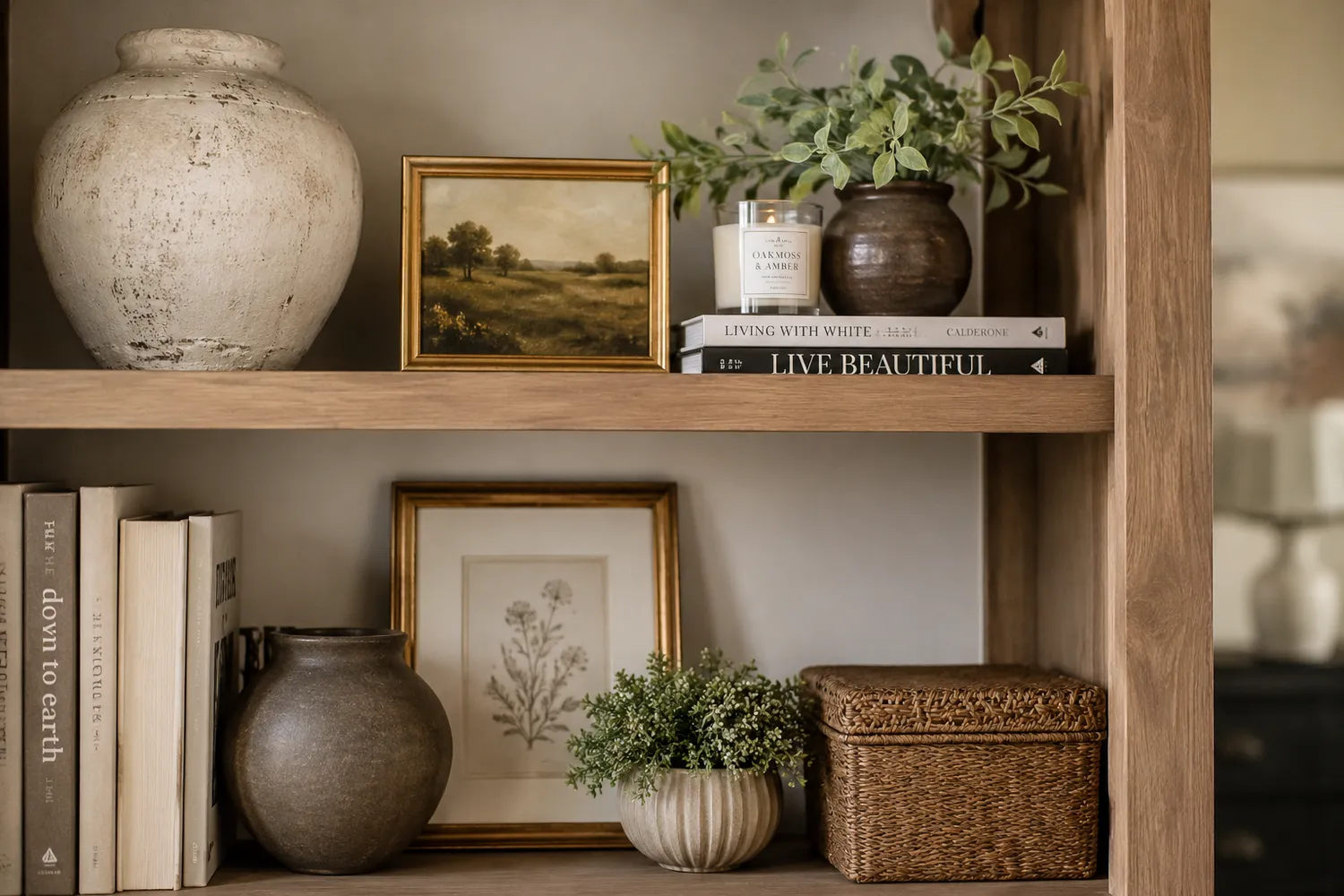
Bookshelves and built-ins can either add warmth, personality, and visual balance to a room or make it feel cluttered and chaotic. Thoughtful styling matters because these large visual surfaces help set the tone of the entire space, creating a home that feels curated, inviting, and intentionally designed rather than overfilled or disorganized.
The good news is that well-styled bookshelves are not about buying more things. It is about understanding a few key principles that designers use every time. Here are the most common mistakes people make and exactly how to fix them.
The Most Important Principle to Know First
Before we get into the mistakes, here is the principle that drives everything else. A well-styled bookshelf should feel curated, layered, and breathable. Not packed. Not perfectly symmetrical. Not filled just to fill space.The goal is visual rhythm, not maximum storage. Keep that in mind as you read through each mistake below.
Mistake #1: Filling Every Single Inch
This is the number one mistake, and it is incredibly common. People feel like empty space on a shelf means something is missing. So they fill every inch until the shelf feels complete. The result is clutter, visual overwhelm, no focal point, and nothing that stands out.The Fix:
Leave negative space. Empty space is not a flaw in the design. It is part of the design. A shelf that is only 60 to 80 percent full often looks far more elevated and intentional than one that is completely packed.
• Good styling is often about removing more than adding. Edit ruthlessly.
Mistake #2: Using Lots of Tiny Decor Pieces
Tiny frames, little signs, small figurines, and random objects collected from various places. Each one on its own seems harmless, but together they create visual noise very quickly. The shelf ends up looking busy and restless rather than styled.The Fix:
• Use fewer objects at a larger scale. One substantial vase is worth more visually than six tiny objects clustered together.• When you do use smaller pieces, group them intentionally rather than spreading them across every shelf.
Mistake #3: Everything Is the Same Height
When all the books and decor on a shelf are similar in height, the shelf feels flat and boring. Your eye moves across it without stopping anywhere because there is no variation to create visual interest.The Fix:
Create height variation within each shelf by mixing:
• Upright books of varying heights
• A tall vase or sculptural piece
• A medium object, like a ceramic or framed piece
• A low bowl or organic element at the base
Mistake #4: Making It Too Perfectly Symmetrical
Perfectly mirrored shelves can feel stiff, formal, and overly staged, especially in homes meant to feel warm and lived-in. Symmetry signals effort in a way that can feel unnatural.The Fix:
Aim for visual balance, not exact duplication. You want the shelf to feel balanced overall when you step back and look at it, but each individual section should have its own character. Think of it the way you would arrange a room: balanced but not matched.
Mistake #5: No Personal Meaning Anywhere
Shelves filled entirely with generic decor from a single store can feel soulless, even when they look polished. Something is missing, and most people can sense it even if they cannot explain it.The Fix:
The best shelves mix objects that have meaning alongside intentional decor pieces. Think about including:
• Objects collected from travels or meaningful experiences
• Natural textures like wood, stone, or organic objects
• A framed photo or piece of art that is personal to you
Mistake #6: Too Many Competing Colors
When every object on a shelf is a different color with no relationship to anything else, the result is visual chaos. Your eye does not know where to go, and nothing feels intentional.The Fix:
Limit and repeat your palette. You do not need everything to match, but the tones should relate to each other. Designers typically repeat a few anchor tones throughout the shelf styling, such as:
• Blacks or dark accents
• Creams and neutrals
• Brass or warm metallics
• Greens from plants or ceramic pieces
Mistake #7: Ignoring Texture Completely
When every object on a shelf is smooth, shiny, or made of the same material, the shelf feels flat regardless of how nicely it is arranged. Texture is what gives shelves warmth and depth.The Fix:
Layer different textures throughout your styling. Try mixing:
• Ceramic or pottery pieces
• Something woven like a small basket
• Glass or metal accents
• Books in varying colors and sizes
• Greenery, whether real or high-quality faux
Mistake #8: Letting the Shelf Become a Dumping Ground
This one happens gradually. Cords get tucked behind books. Random papers land on a shelf. Mail gets stacked. Mismatched junk accumulates. Before long, the shelf that was once styled looks like a storage unit. This instantly kills the aesthetic, no matter how beautiful the original styling was.The Fix:
Edit ruthlessly and reset regularly. Walk past your shelves with fresh eyes every few weeks and remove anything that does not belong. Styled shelves require a little maintenance, not a lot, but they do need occasional attention to stay looking intentional.Two Designer Secrets Worth Knowing
1. Give your eyes places to rest.
Well-styled bookshelves have what designers call visual rests. These are intentional pauses in the styling that allow the eye to pause before moving on. Stacked books, empty space, and simple objects all create these resting points. Without them, a shelf feels visually exhausting even when it looks full of beautiful things.2. Your built-ins should talk to the rest of the room.
Built-ins should not feel like a separate decorating project happening in isolation. The styling should echo the colors, textures, finishes, and mood of the room around them. Pull tones from your rug, your pillows, your furniture. That connection is what creates cohesion and makes a room feel like a designer touched it.The Ideal Bookshelf Formula
If you want a simple starting point, a well-styled shelf generally includes some version of these elements balanced across the whole unit:
• An organic element like a plant, greenery, or natural object
• A sculptural or ceramic object with visual weight
• A framed piece or small artwork
• Varied heights throughout
• Intentional negative space
The goal is never to show how much decor you own. The goal is for the shelf to feel collected, warm, and intentional. When you get that right, people walk into the room and feel it even before they look directly at the shelves.
Ready to Restyle Your Shelves?
Start by taking everything off. Yes, everything. A blank shelf is so much easier to work with than one you are trying to edit around. Lay everything out, group similar items together, and then put back only what earns its place.
With love,
Holly
Simple Things Made Beautiful